Access Amplified: Design Sprint
Leveraging a 1-week design sprint to impact enormous change

Overview
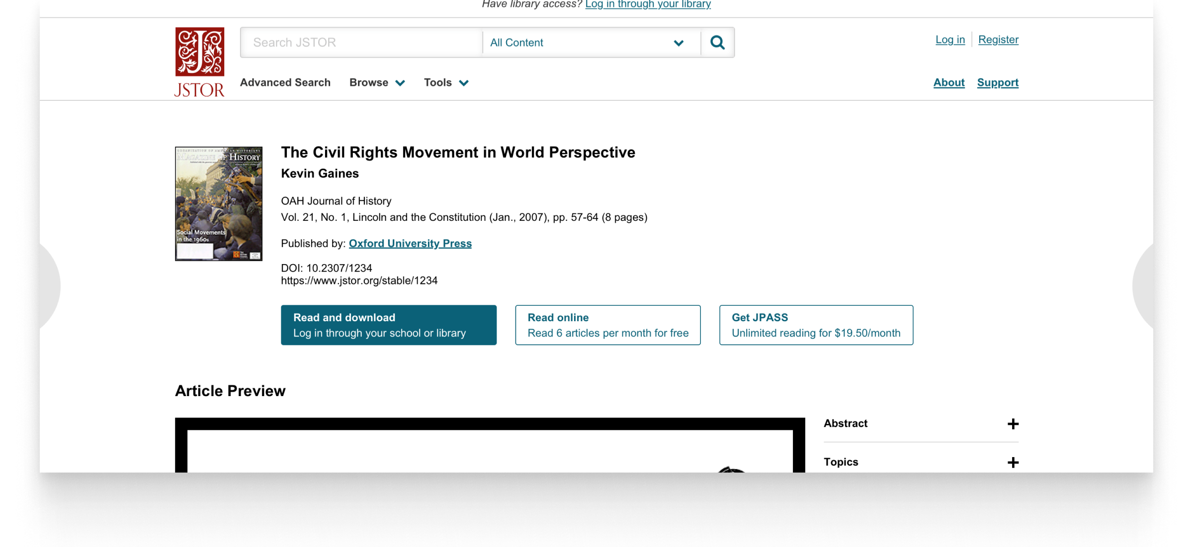
JSTOR's most visited page is a page that denies a user access to content. It has a bounce rate of over 70%. We hypothesized that a good number of folks visiting this page actually have access through their school.
I lead our team through a 1-week design sprint to reimagine this page and validate with users.
Role
Product Design
Product design, Interaction design, UX research
Context
JSTOR's most visited page was a page that denied users access to content and had a bounce rate over 70%. Our team hypothesized that a good number of these visitors actually did have some sort of access.
Usign a design sprint, we rallied around the problem, defined our point of view (POV), clarified the problem we wanted to solve, conducted competitive analysis, sketched ideas, and tested multiple prototypes.
Establishing our POV
Our first step was to collectively establish our point of view. This clarity would function as a North Star for our sprint activities and ultimately the design we test with users.
Here's our guiding light:
- Access should be easy and as free as possible
- It should be easy to evaluate content
- Access through your school should be prioritized over any other method
- Alternative paths should be clear
- Those new to JSTOR should understand what we're about
Crafting our problem statement
Researchers with institutional access
want something to
help them easily evaluate and decide if they want the content
so they
feel confident they found something useful for their research.
Research
After establishing our POV and crafting our problem statement, we then conducted competitive analysis where we all found at least one example of a page that denied access to something (I chose Audible).
We then sketched our ideas, talked through our ideas and how they did or did not follow our POV or problem statement. Following this, we voted on which ideas we wanted to build into a prototype.
Prototyping
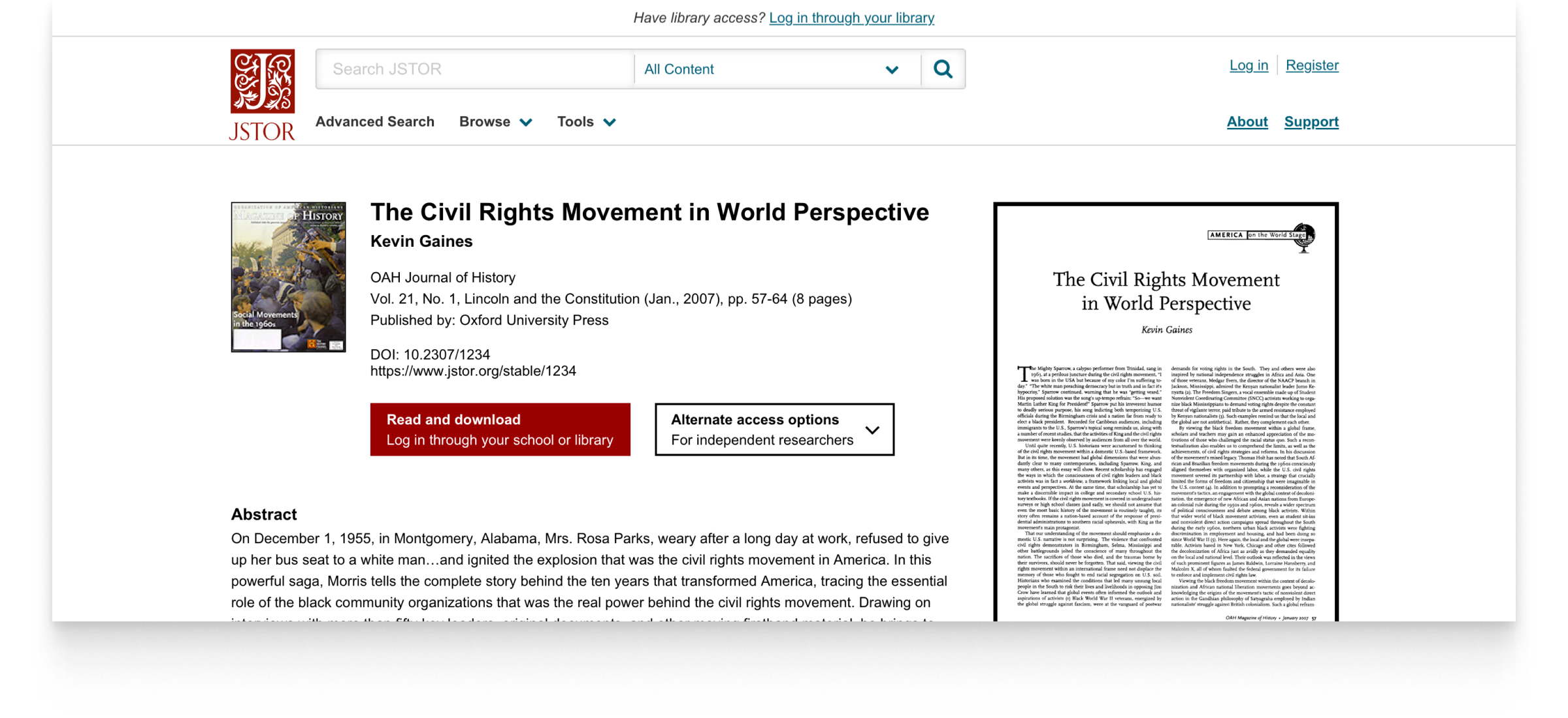
After testing our initial prototype, we knew we were on the right track, but there was still opportunity to improve the experience. We then quickly iterated on our design and tested a second prototype the very next day.
Initial prototype
Second prototype
Testing our design at scale
While we were confident in our design direction after our second prototype, we knew that testing at scale would yield more definitive results.
Our team wanted to learn:
- Can users evaluate the content?
- Can they get to the institution finder and get authenticated?
- Can they use their preferred access method?
Results
- Overall, we saw higher engagement with the new design. We saw longer time on page and more engagement with the content (reading previews). This lead us to believe we were successful in helping people evaluate the content.
- The new design had a 6% higher conversion rate in getting folks from this turnaway page to their school's login. For a page that has millions of views, this is significant.
- The new design had an 11% lower bounce rate, higher number of pages per session, and longer time on page.
Based on these results, we decided to implement the new design 🚢